
Role
UX Researcher, Product Designer, Branding
overview
Conducted research and designed iOS mobile app concept aimed to connect community garden organizers to volunteers and gardeners.
Background
The goal of this academic project was to design a minimal viable product (MVP) for a mobile app from the ground up. During the brainstorming phase, I compiled a list of potential ideas. One concept that stood out was community gardening—a personal interest of mine that I had always wanted to pursue but didn't know how to get involved in. This led me to the idea of creating a platform that connects individual gardeners with community garden organizers.
1. Research
Process
Creating a product from scratch requires a great deal of research in order to understand the problems users face and to design effective solutions. Some of the questions that guided my research were:
・What motivates individuals to join a community garden?
・What are the typical processes for joining?
・What hierarchies and structures exist within community gardens?
・What problems do both organizers and gardeners/volunteers face?
・What are the typical processes for joining?
・What hierarchies and structures exist within community gardens?
・What problems do both organizers and gardeners/volunteers face?
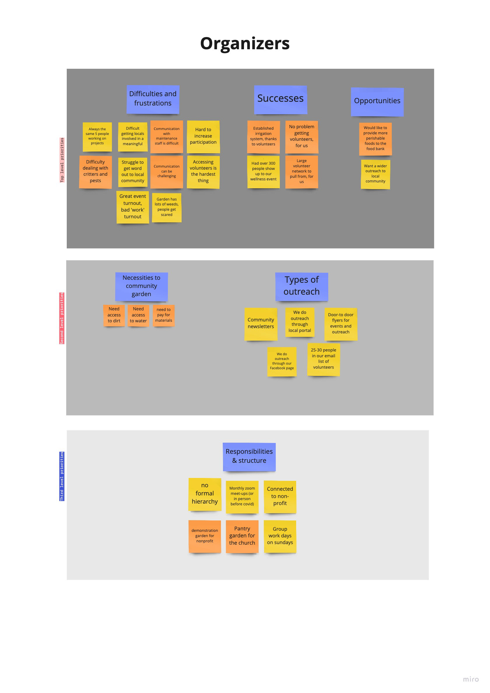
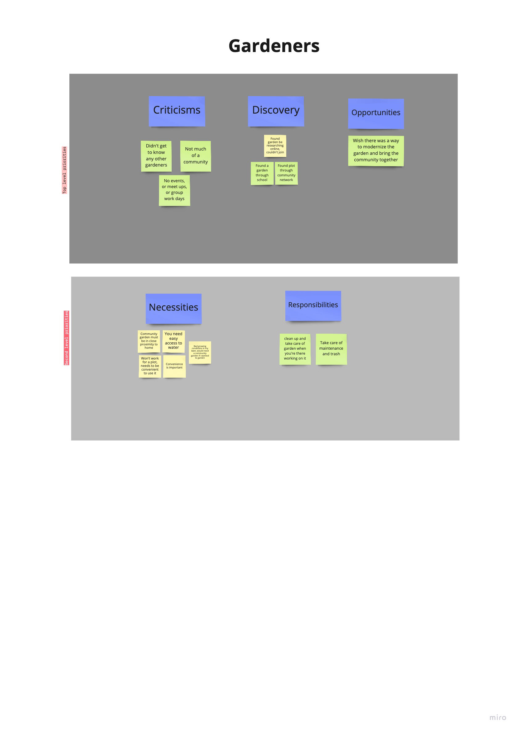
User Interviews
I conducted in-depth, one-on-one interviews in order to answer the questions outlined above. I interviewed 2 organizers and 2 people with previous community gardening experience. I used the tool 'Miro' to synthesize my findings into affinity maps.
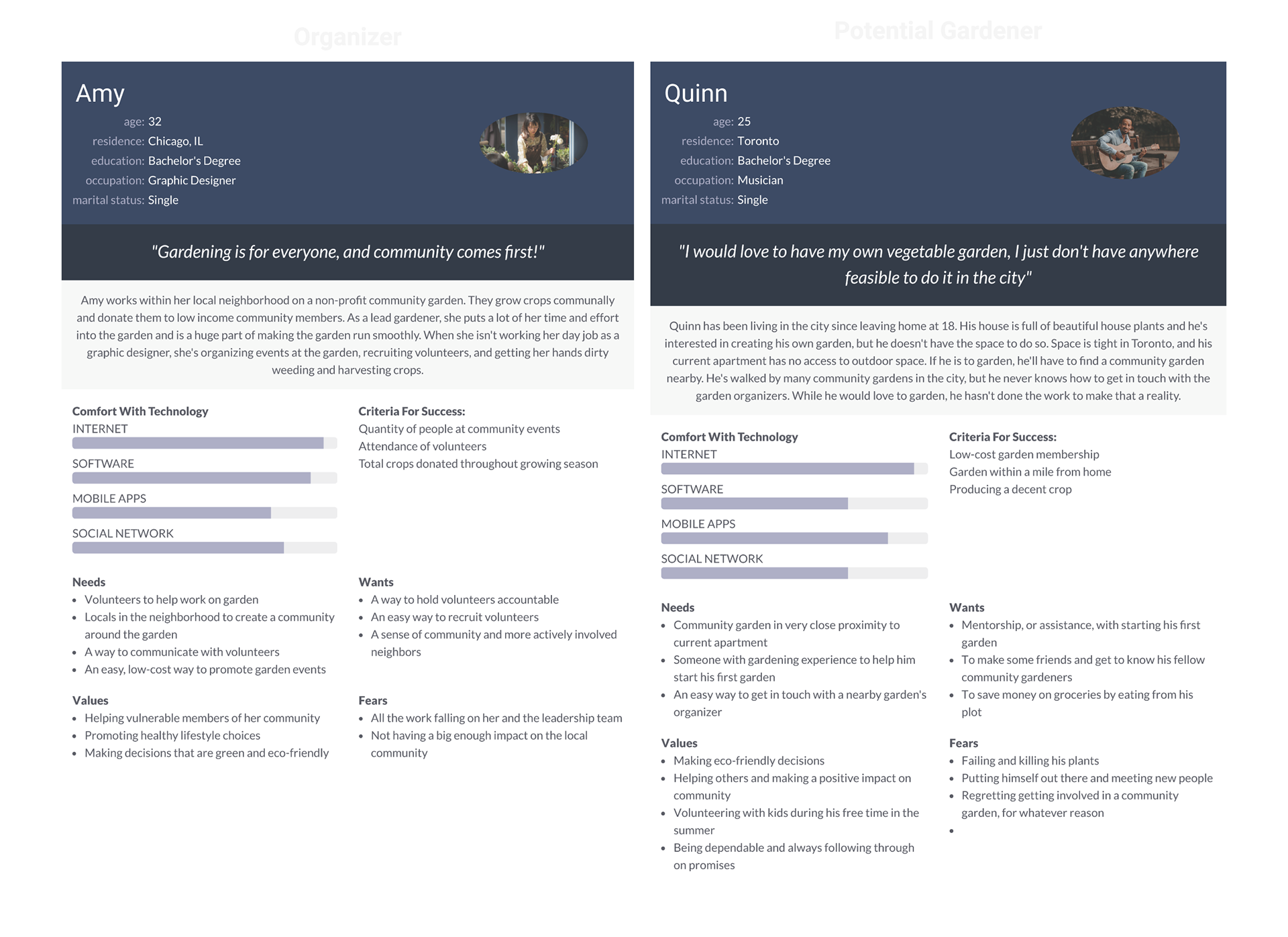
User Personas
Given the dual-sided nature of my app, I created two separate personas, one for a community garden organizer and one for a gardener. I wanted to put myself in the shoes of the user so I could better understand their needs and make sure I create an app that's actually helpful.
2. Ideation, Information Architecture
Problem
For the MVP, I chose to focus on the gardener side of the app rather than the organizer due to its more sophisticated needs. I then asked myself how might we allow our users to:
・Search for local gardens
・Determine if a garden fits their needs
・Communicate with organizers or other gardeners
process
Thanks to my research, I had already developed a clear vision for the app's architecture and identified the essential user flows needed to address users' problems. I was meticulous during this stage to ensure my designs were thorough, effective, familiar, and painless.
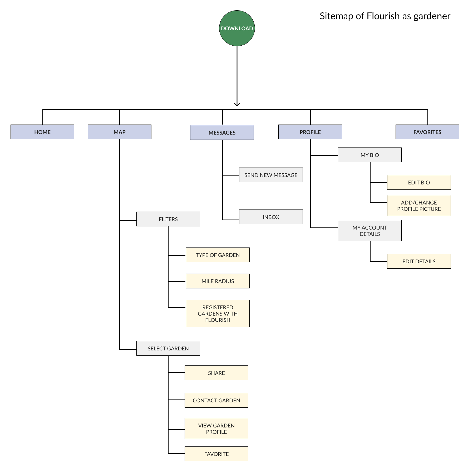
sitemap
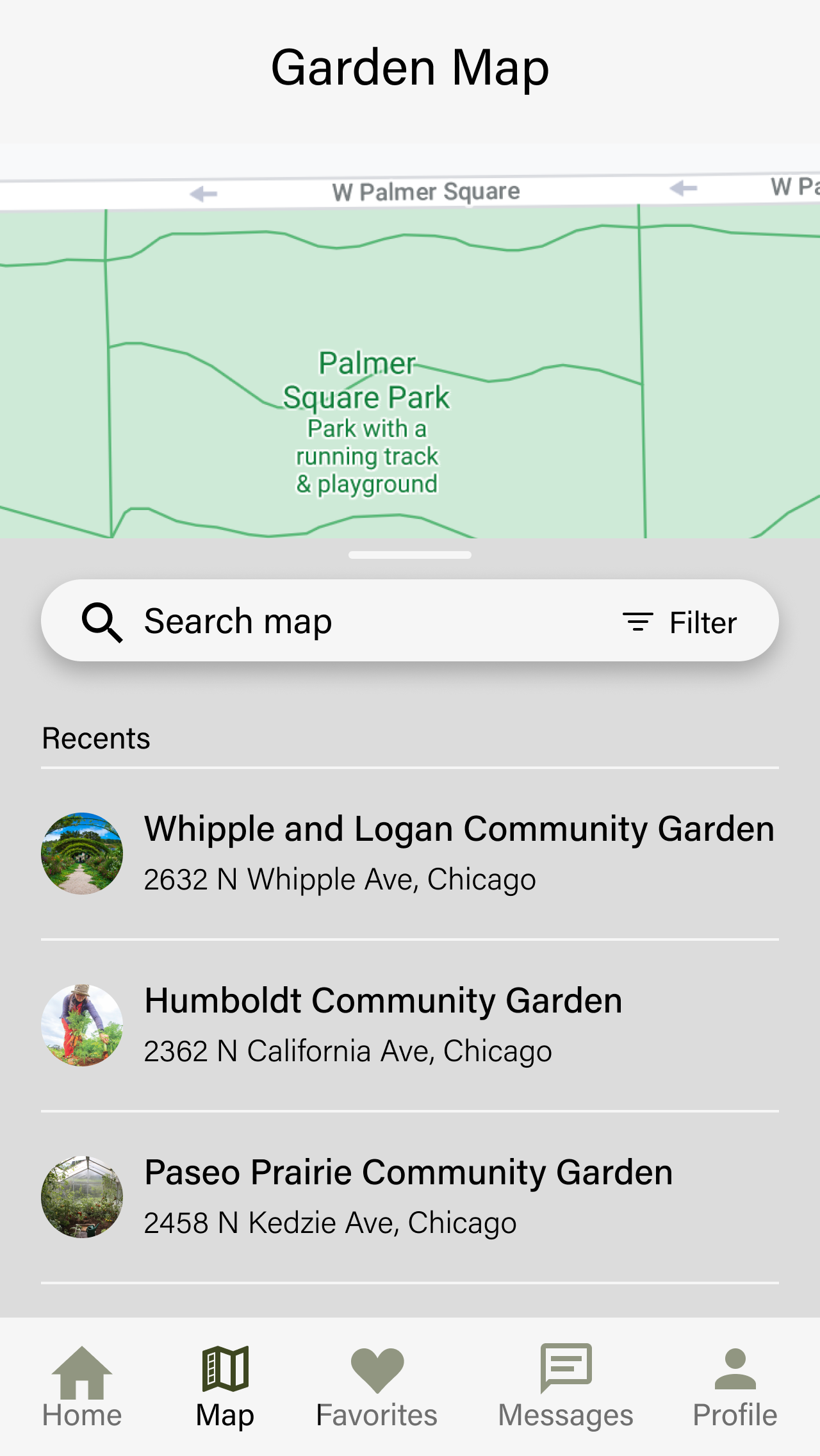
The bottom nav is a critical aspect of any mobile app. I wanted to be sure I categorized each section of the app in a intuitive way to ensure easy navigation and to lay a solid foundation for more features down the line.
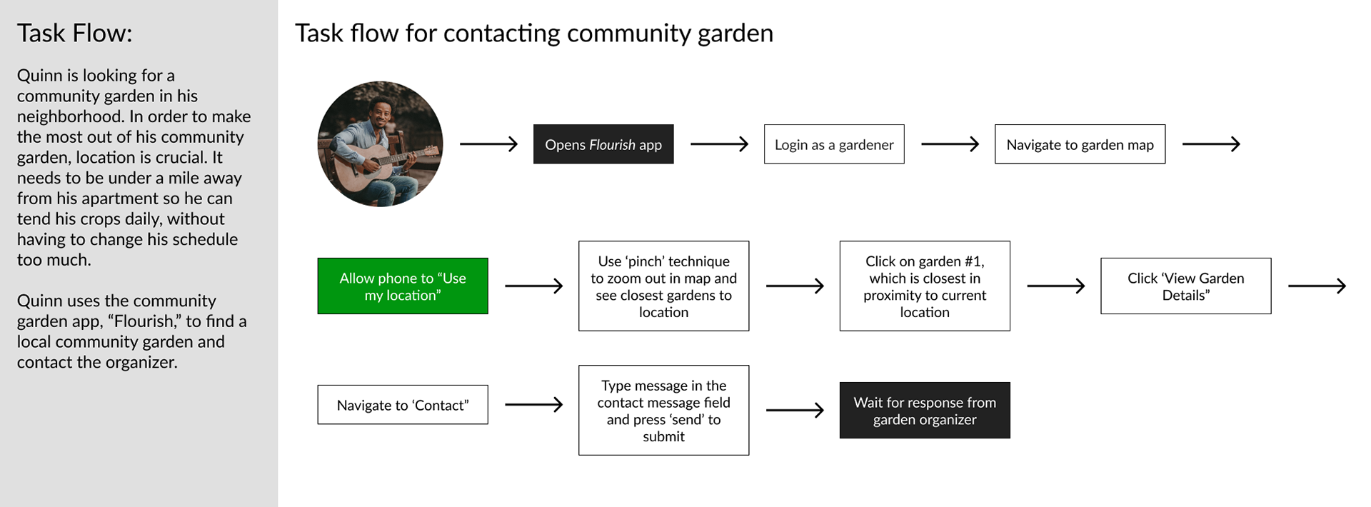
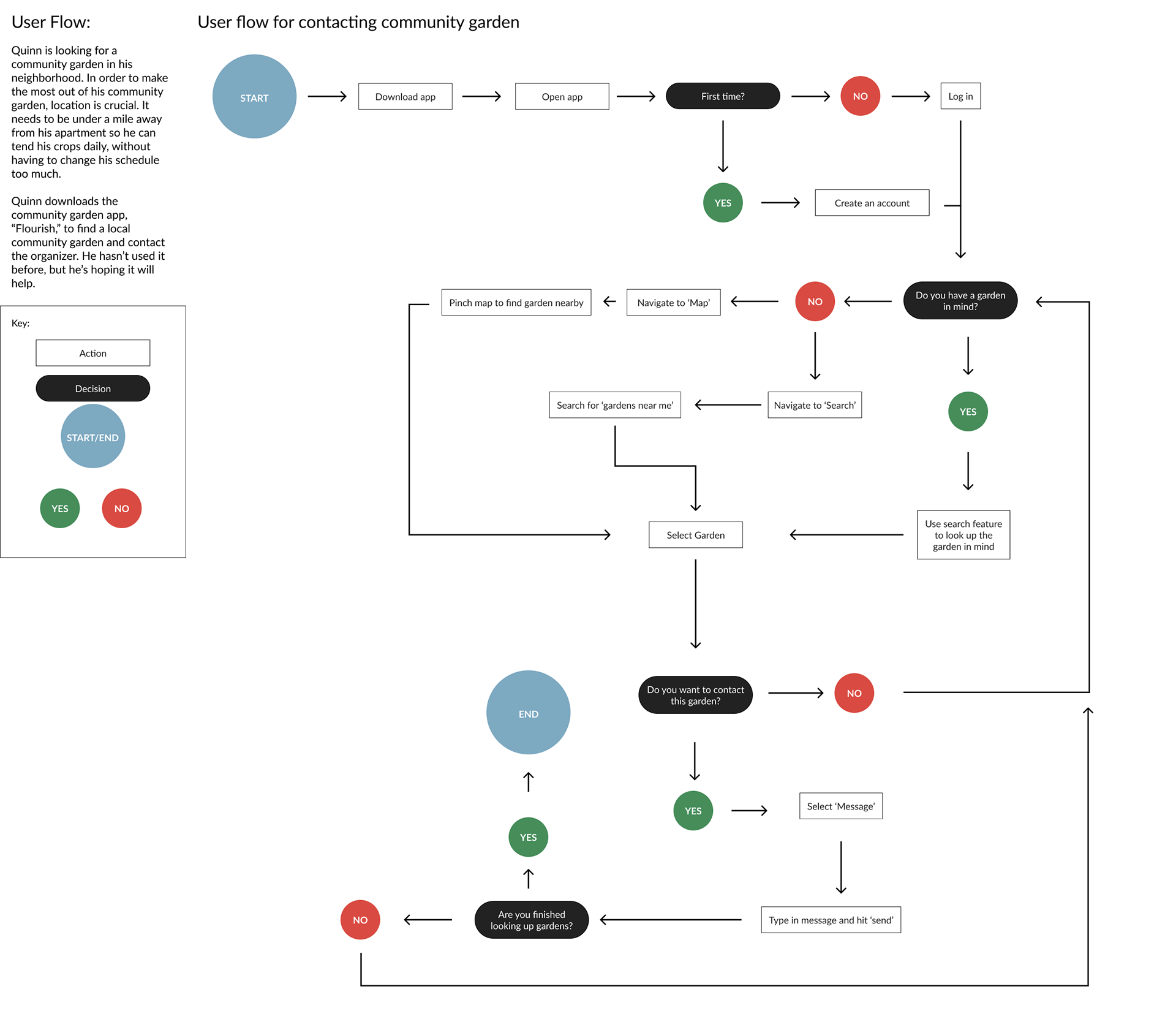
Task & user flow
I created a task flow and user flow for Quinn. At the very least, Quinn would need to easily find a garden, contact the organizer, and determine if the garden fit his criteria for joining.
wireframes (Low fidelity)
I started my wireframes with a few sketches and then I started digitizing my favorites in Figma. You'll notice some disparity between these initial wireframes and what you'll see down the line.
3. User Interface Design
process
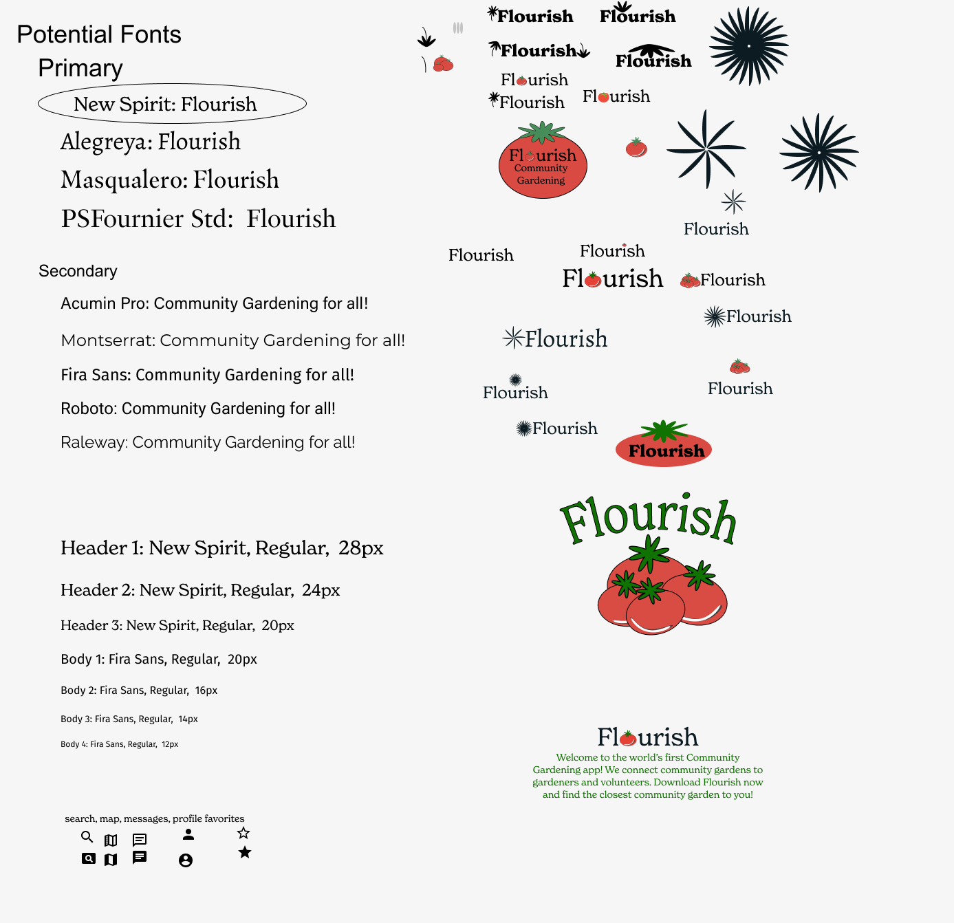
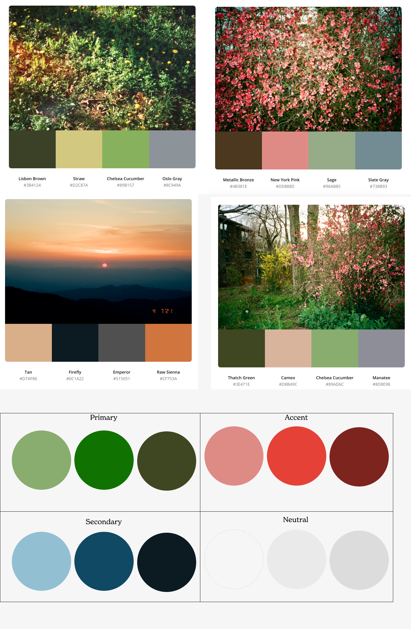
Given that this app's users are connected to gardening and nature in some way, I chose earth tones for the logo and color palette to reflect this connection. My goal was to evoke a sense of nature, bridging the digital and real worlds. Using Canva, I extracted colors from recent photos, resulting in four palettes. From these, I selected four main colors and created light, standard, and dark versions of each for various uses. For fonts, I paired a primary serif with a secondary sans serif to enhance aesthetic appeal and establish design hierarchy.
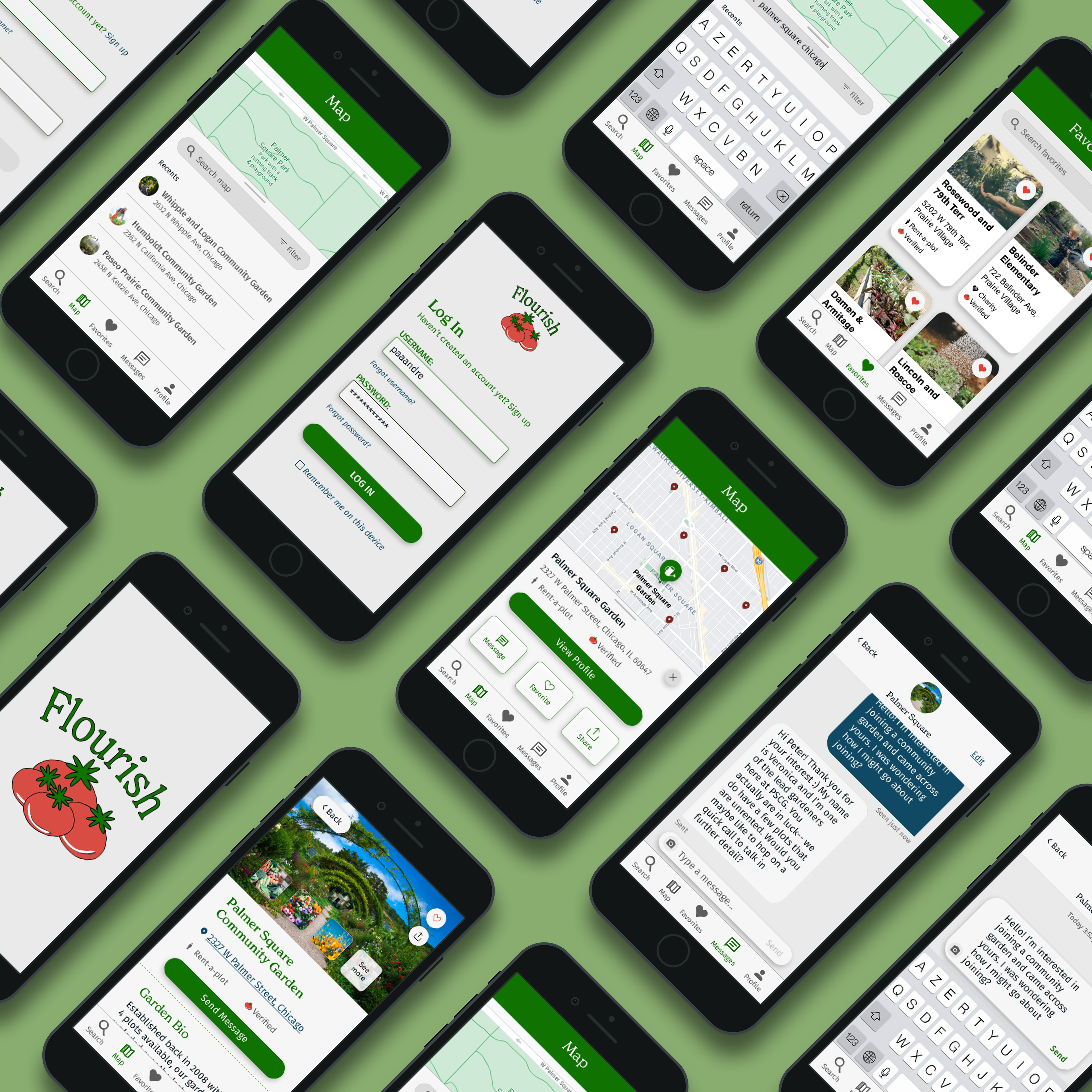
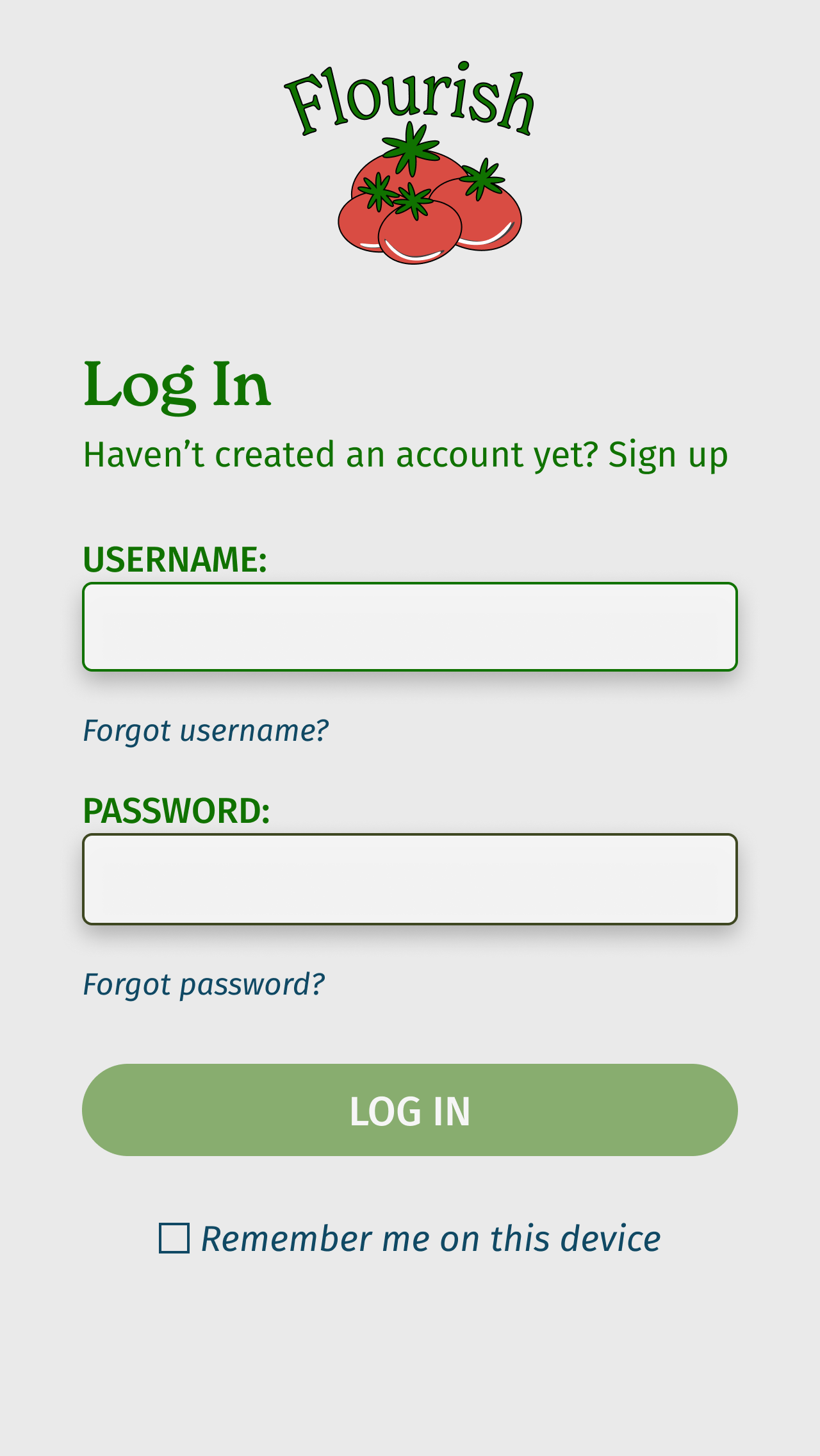
Wireframes (High fidelity)
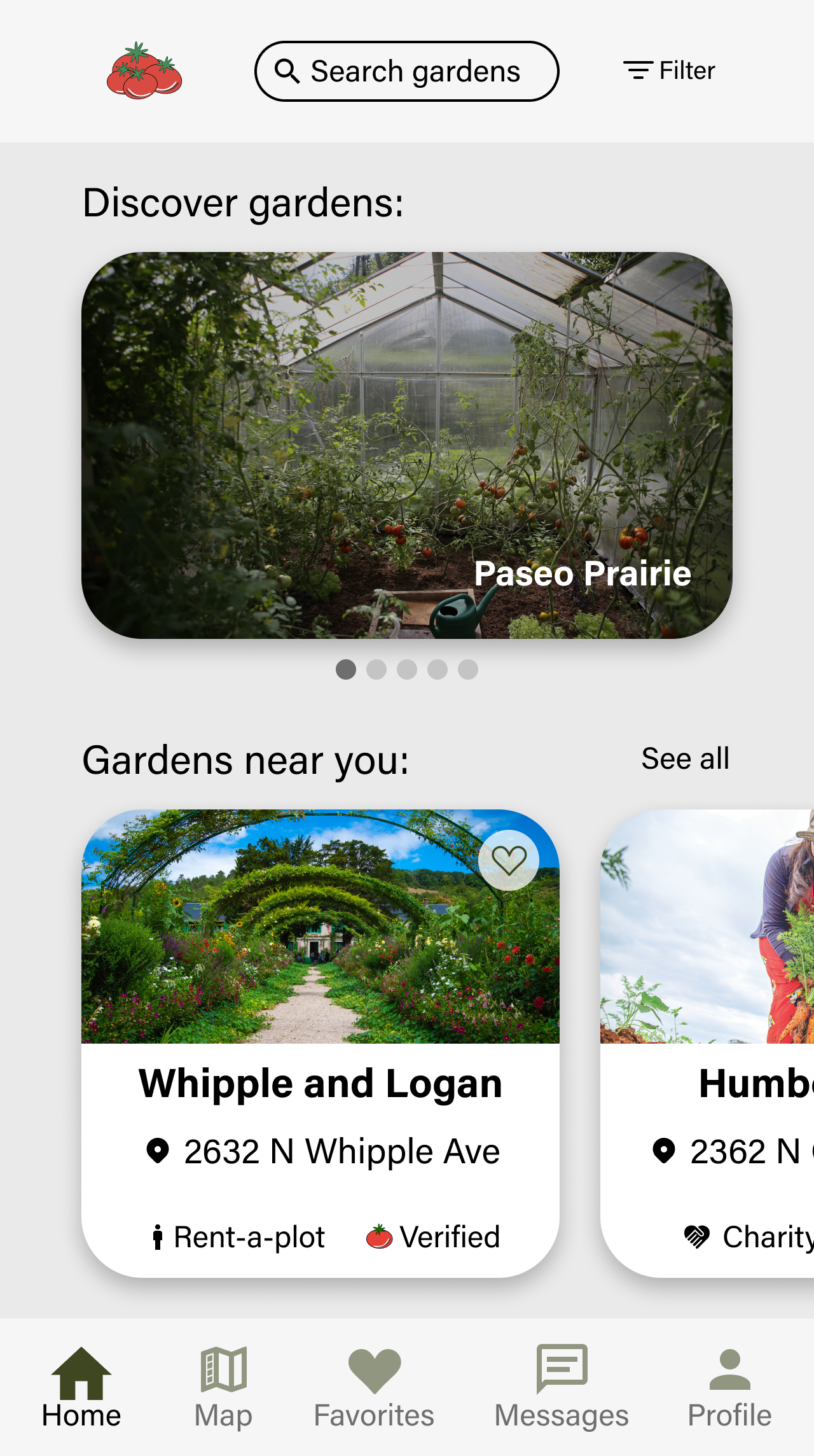
After experimenting with my initial wireframes and really putting myself in the shoes of the user, I realized that the MVP had no need for a 'Home' navigation option. At this point, the focus should be on allowing a user to quickly solve the problem of searching for a garden and messaging them. I chose to replace 'Home' with 'Search' as a result.
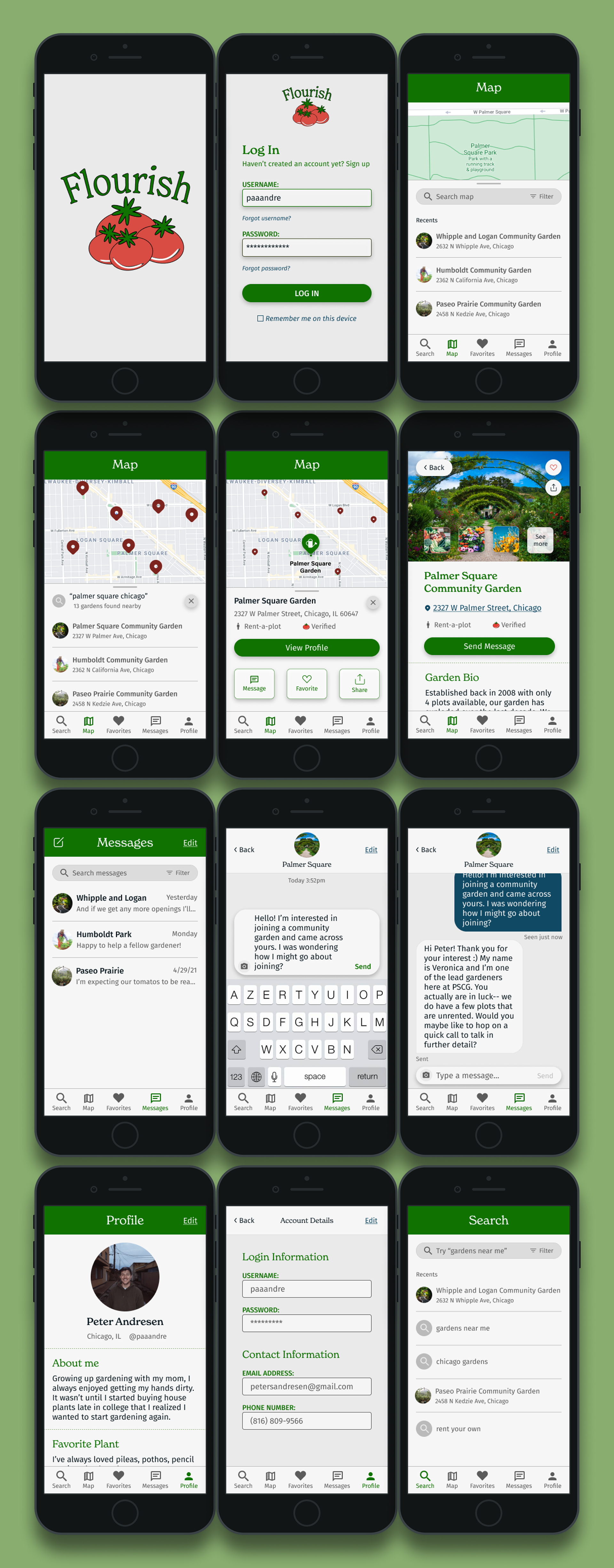
protoyping
After finalizing my wireframes, I prototyped them so that I could conduct usability test to gain an understanding of what about the app works, and what doesn't.
4. Testing
Process
My goal during testing was to identify design errors, usability issues, and gather feedback for further iterations. I considered combining the 'Search' and 'Map' navigation options, but the meta-search logic required would be too complex for the current development phase as is.
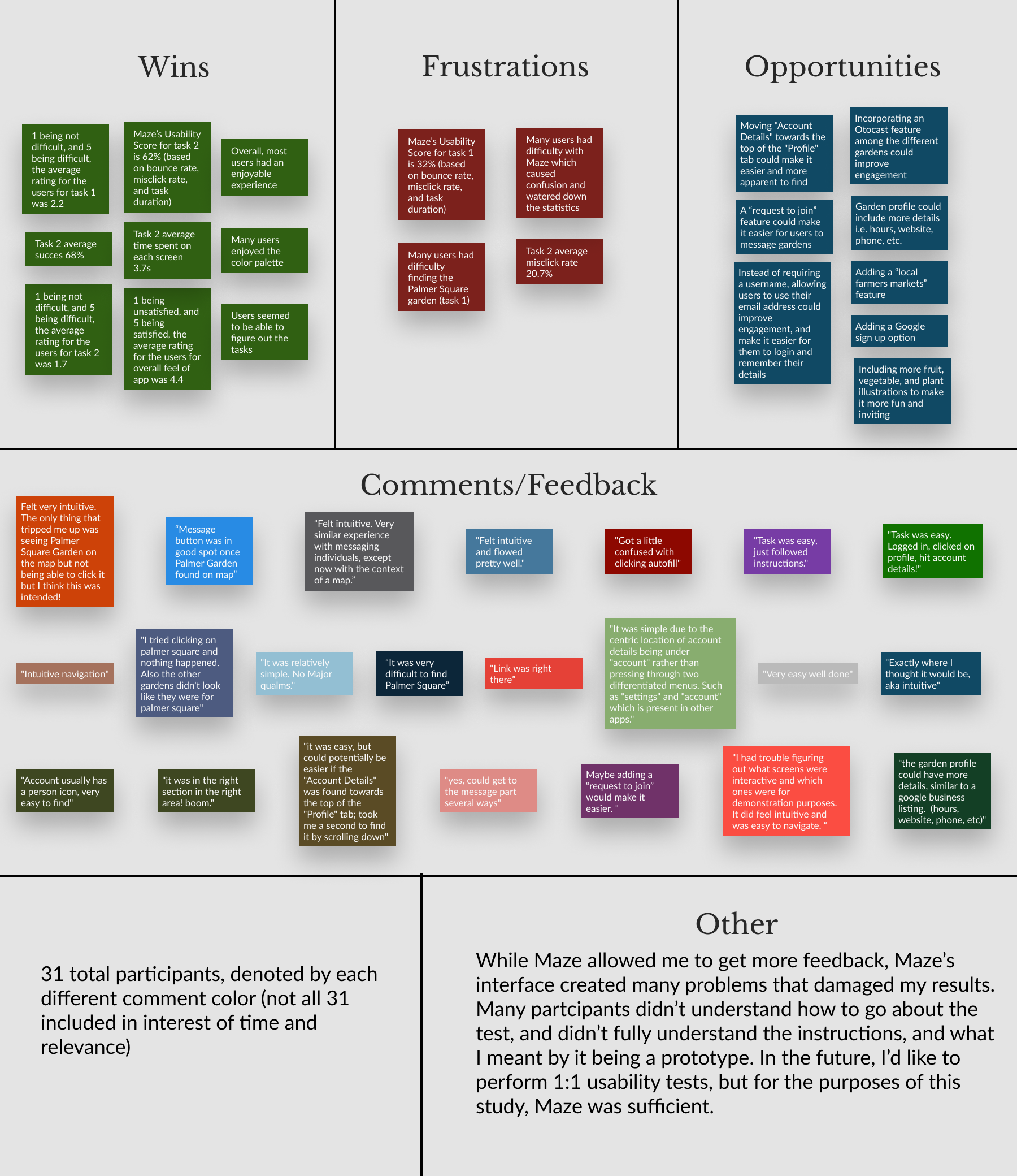
Usability Testing
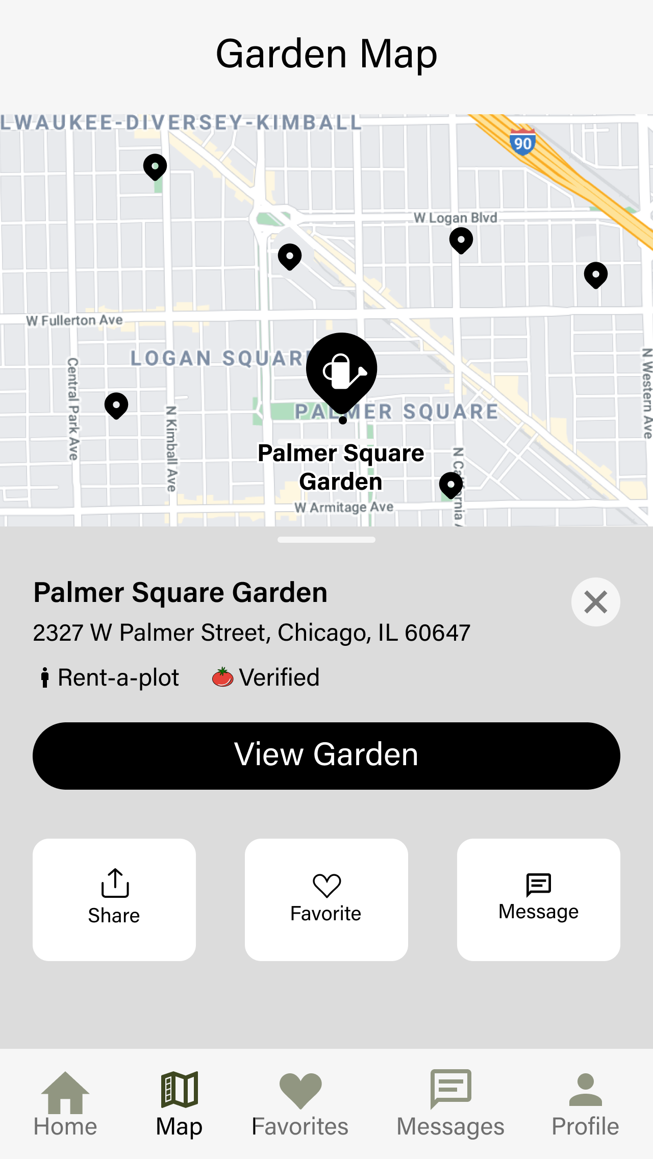
I was thrilled to have 31 participants for my usability tests. Using Maze, I designed two tasks for users to complete and provide feedback on afterwards. The first task was to find and message Palmer Square Garden, and the second was to locate the Account Details page.
final thoughts
Creating the MVP for Flourish was a rewarding experience, especially during the research phase. I really enjoyed learning about community gardening and seeing how directly it ended up enriching the design process. The usability testing was also exciting, with a large number of participants providing valuable feedback. While much of the feedback was positive, I also received several ideas for improving the overall user experience. After all, that's the ultimate goal!