ROLE
Product Designer
OVERVIEW
Led incremental and strategic UI/UX improvements to the iOS mobile app to keep user experience modern, intuitive, and aligned with user expectations shaped by leading apps.
BACKGROUND
Let’s be honest — not every design task fits neatly into a traditional case study. UX work is often messy, iterative, and nuanced. Some improvements happen in the margins — small but meaningful enhancements that are proposed, approved, and implemented between larger initiatives.
Below are several iOS app improvements I’ve proposed, led, designed, and supported in development. These changes reflect an ongoing effort to modernize the experience, improve usability, and elevate the visual design in ways that align with user expectations — even when there's no sweeping redesign or dramatic narrative.
Update #1: Restaurant Search Results
HOW IT STARTED
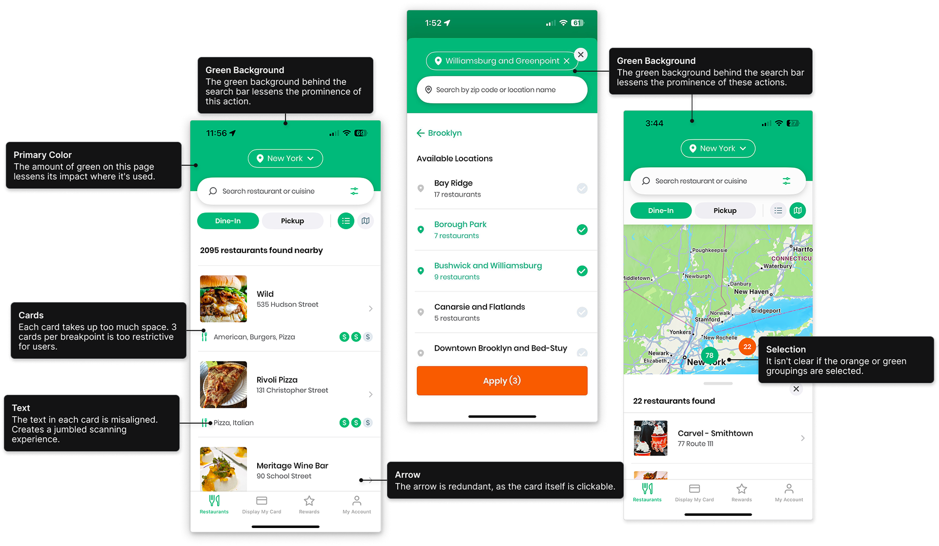
Our restaurant search results had been patched together after a previous redesign, resulting in a less-than-ideal user experience — largely due to legacy image ratio decisions that constrained layout flexibility. Recognizing an opportunity amidst other ongoing work, I proposed a set of simple, high-impact improvements that enhanced usability and visual consistency without placing a heavy lift on our mobile app development team.
MY ANALYSIS
Here are the annotations I provided to the team for the restaurant results layout at that point in time:
New Designs
In conjunction with my analysis of the original layout’s shortcomings, I redesigned the necessary pages in Figma and annotated the wireframes to clearly articulate the rationale behind my design decisions.

Results
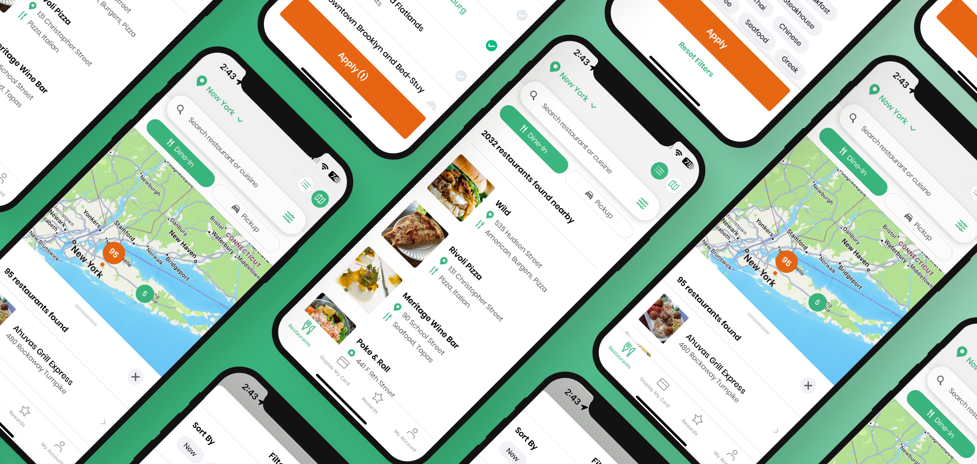
Our iOS engineer quickly aligned with my proposed changes. We agreed on a slightly different shade of gray to replace the original green and moved forward with development. I meticulously tested multiple TestFlight builds before submitting to Apple for approval, followed by additional testing post-approval to ensure everything functioned as expected. I've provided screenshots of the current app below:

Update #2: Rewards Tab
HOW IT STARTED
I noticed some friction and visual clutter in the Rewards tab of our iOS app. The layout felt a bit off—unclear hierarchy, too many low-priority CTAs, and not a lot of helpful guidance for users trying to earn or claim rewards. It also just looked a little dated and didn’t match the polished feel users expect from modern apps.
background
One of the big perks of Foodie Card is our rewards program—members earn 1 point for every $1 they save using the card. To get those points, they upload their receipts in the app and can track their progress as they go.
Once they hit 300 points, they can redeem them for a $15 gift card to one of our retail partners. It takes some commitment to make it to 300 points, and there’s a real opportunity to make it more engaging. Adding some fun, gamified elements could help boost daily usage and make people more motivated to stick with their subscription—especially if they’re close to a reward.
MY ANALYSIS
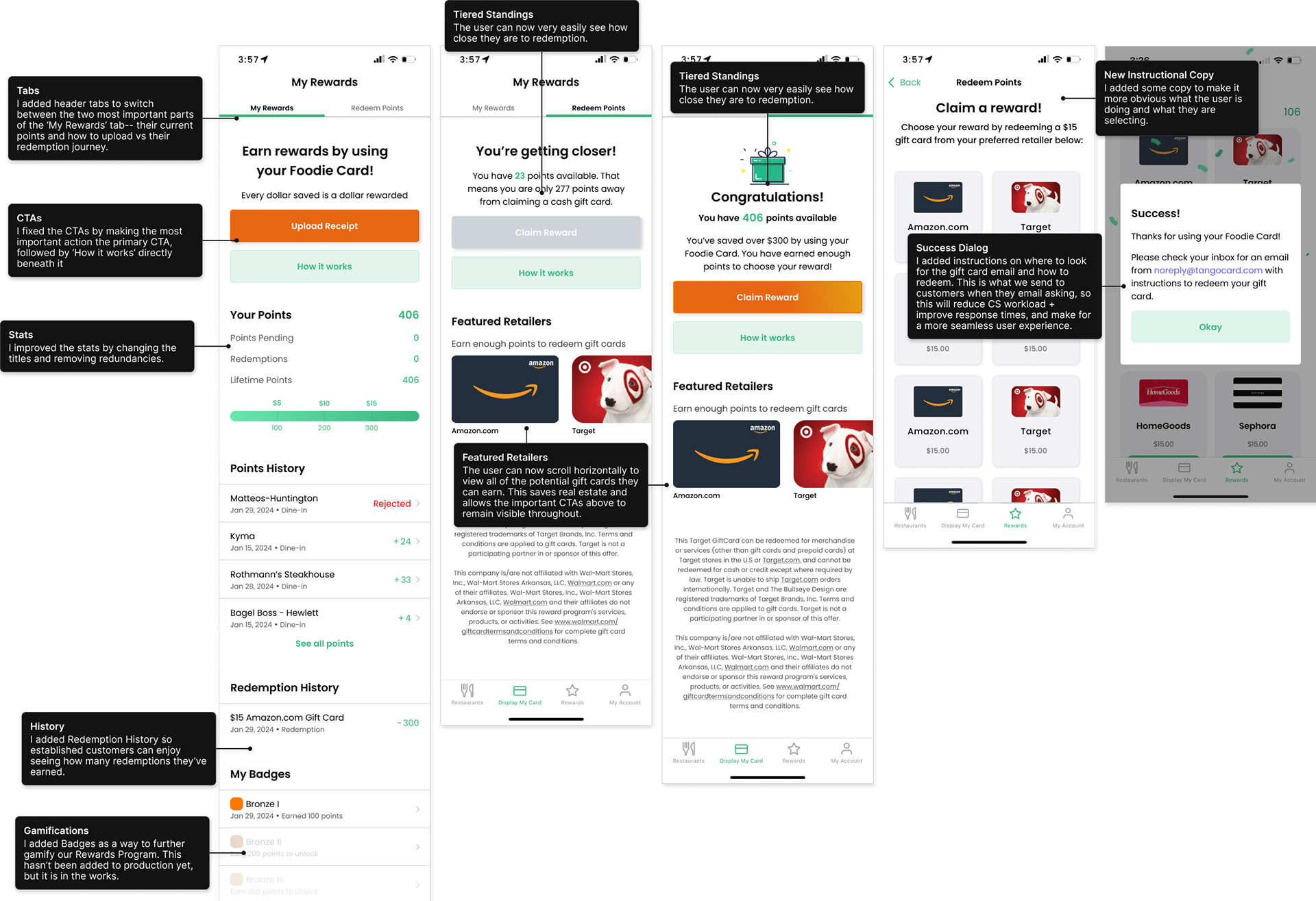
I took the initiative to dig into the experience and map out what wasn’t working. I started by outlining what was wrong with the design at the time.

New Designs
The first thing I tackled was the 'My Rewards' screen. I removed stats that weren’t useful, renamed and reorganized the remaining ones to make them clearer and more relevant. I also introduced tiers based on the number of points a user has.
If a user hasn’t hit 300 points yet, the 'Claim Reward' button stays inactive. Once they reach 300, the button becomes active and glows, paired with congratulatory copy and a celebratory illustration to make the moment feel special.
Throughout the redemption journey, I also added helpful, guiding copy to clarify the process and show users exactly where they are along the way.
Results
Our iOS engineer quickly agreed to the changes and got started on implementation right away. After just one TestFlight build, we submitted the update for review. It was a major improvement to the app with minimal development effort—and it’s already being seen as a big improvement.