Project Goals
The goal of this project was to redesign the company website with a clean, professional yet eye-catching tone. After some quick analysis, I realized the website's current color palette wasn't even close to passing usability guidelines. As a result, I needed to determine a new, accessible color scheme that matches the company's current brand identity.
Roles
Sole UX Designer
Tools
Figma, Adobe Illustrator
Timeline
2 weeks
Action Plan
1. Research
2. Ideation & Information Architecture
3. User Interface Design
4. Test & Iterate

1. Research
Methodologies
・Competition & market analysis
・1:1 Customer Interviews
・Customer persona development
・1:1 Customer Interviews
・Customer persona development
Goals
・What motivates & frustrates customers when using a company's website?
・Who are Signature Logo’s biggest competitors?
・What do customers expect from a service-oriented website in a niche industry?
・How should the website's information architecture look?
・Who are Signature Logo’s biggest competitors?
・What do customers expect from a service-oriented website in a niche industry?
・How should the website's information architecture look?
A large portion of my research was speaking with the owner of Signature Logo Embroidery. I wanted to learn more about the industry, her competitors, what types of customers she has, what she wants out of an updated website, etc.
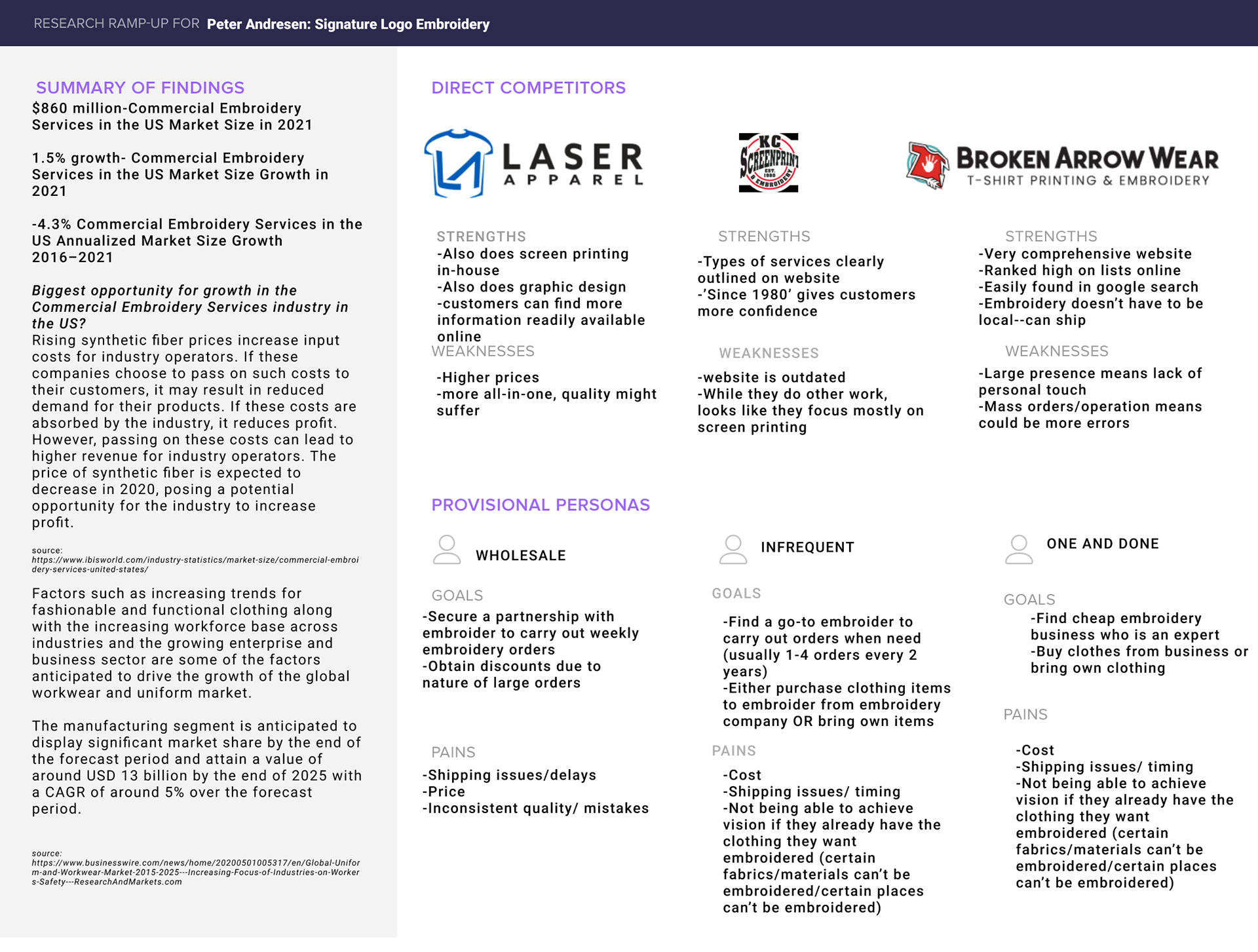
Industry trends, competitive analysis, provisional personas
I interviewed 4 total participants between the ages of 30 and 52. Their overall goal when determining an embroiderer is to find information quickly and without hassle. They also want to make sure the company is trustworthy and legit. Additionally, I asked the participants to review the company's current website and to make comments while doing so. I summarized the interviews into 3 categories. Needs and frustrations refer to websites in general, while opportunities are suggestions based on their current website.
NEEDS
Clean, aesthetically pleasing UI
Easy-to-follow IA
Graphics that compliment copy
Lack of text heavy pages
Forgiving UX when a mistake is made
FRUSTRATIONS
Text heavy pages
Overwhelming landing page
Confusing IA
Incomplete pages such as FAQs
Redundant or confusing
OPPORTUNITIES
Examples of their work
Easy way to see or reach out about pricing
Comprehensive but scannable and easy to find information fast
Personalized touches i.e. pictures of the facility, employees, etc.
Helpful informative sections such as About Us, Company, Contact, etc.
Clearly communicated products and services broken down for quick comprehension
2. Ideation & Information Architecture
Methodologies
・Sitemap
・User flows
・Wireframes (lo-fidelity)
・User flows
・Wireframes (lo-fidelity)
Goals
・Analyze company's current information architecture
・Determine the most fundamental and essential user flow
・Create lo-fidelity wireframes of the screens within essential user flow
・Determine the most fundamental and essential user flow
・Create lo-fidelity wireframes of the screens within essential user flow
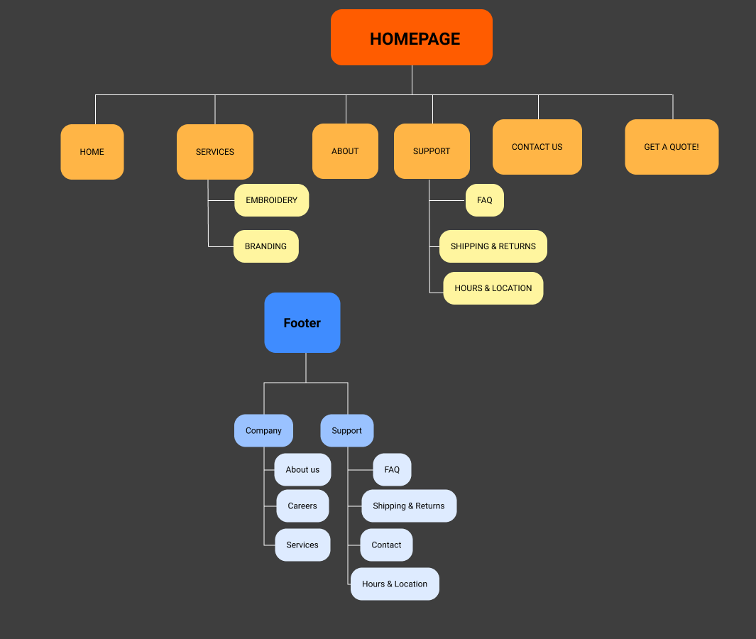
Upon analysis of the current site, I realized the information architecture was in bad shape, and much of the website is still incomplete. As a result, I created my own IA through use of this sitemap.
The "Get a Quote!" category will be the essential user flow that I ended up highlighting in many locations throughout the website. All the navigation options will funnel towards requesting a quote which will create sales leads and allow for more seamless communication for both the customer and Signature Logo.
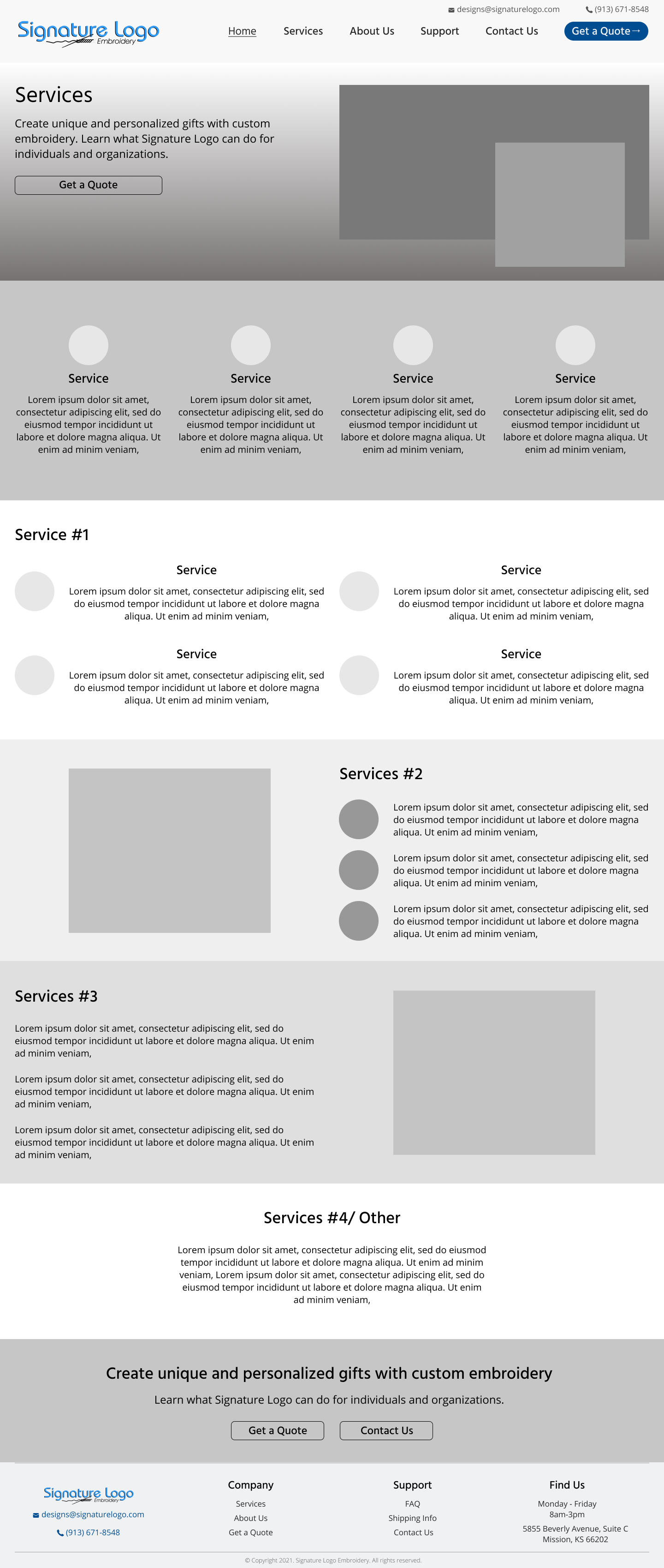
With the sitemap and a better understanding of the essential user flow in mind, I grabbed my notebook and started sketching the groundwork for my wireframes. I designed multiple different layouts for each page of the website and I picked my favorite design of each.
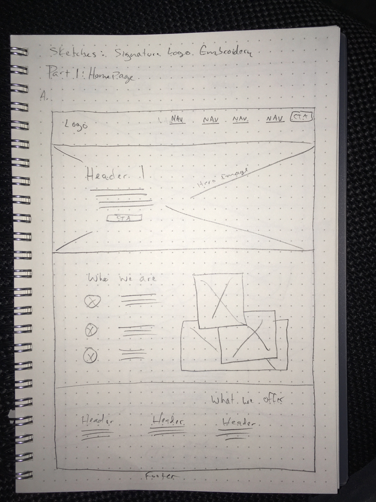

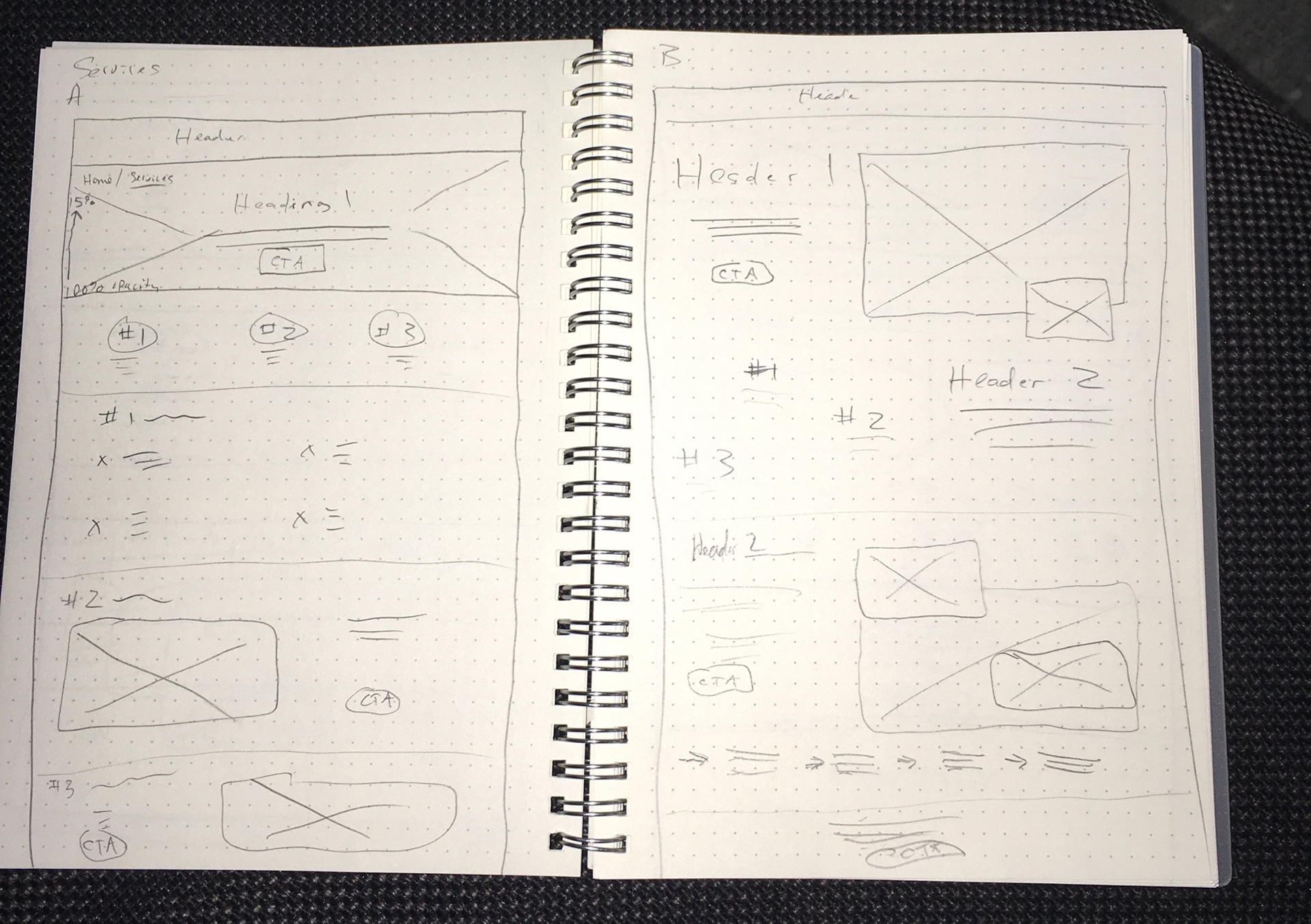
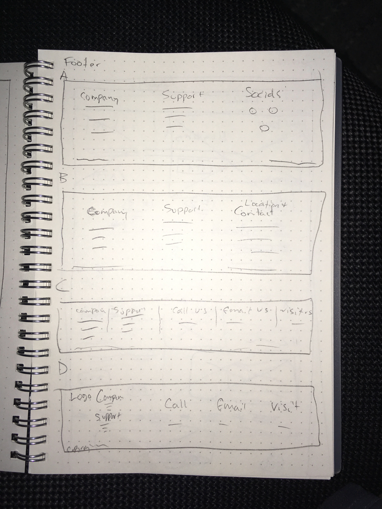
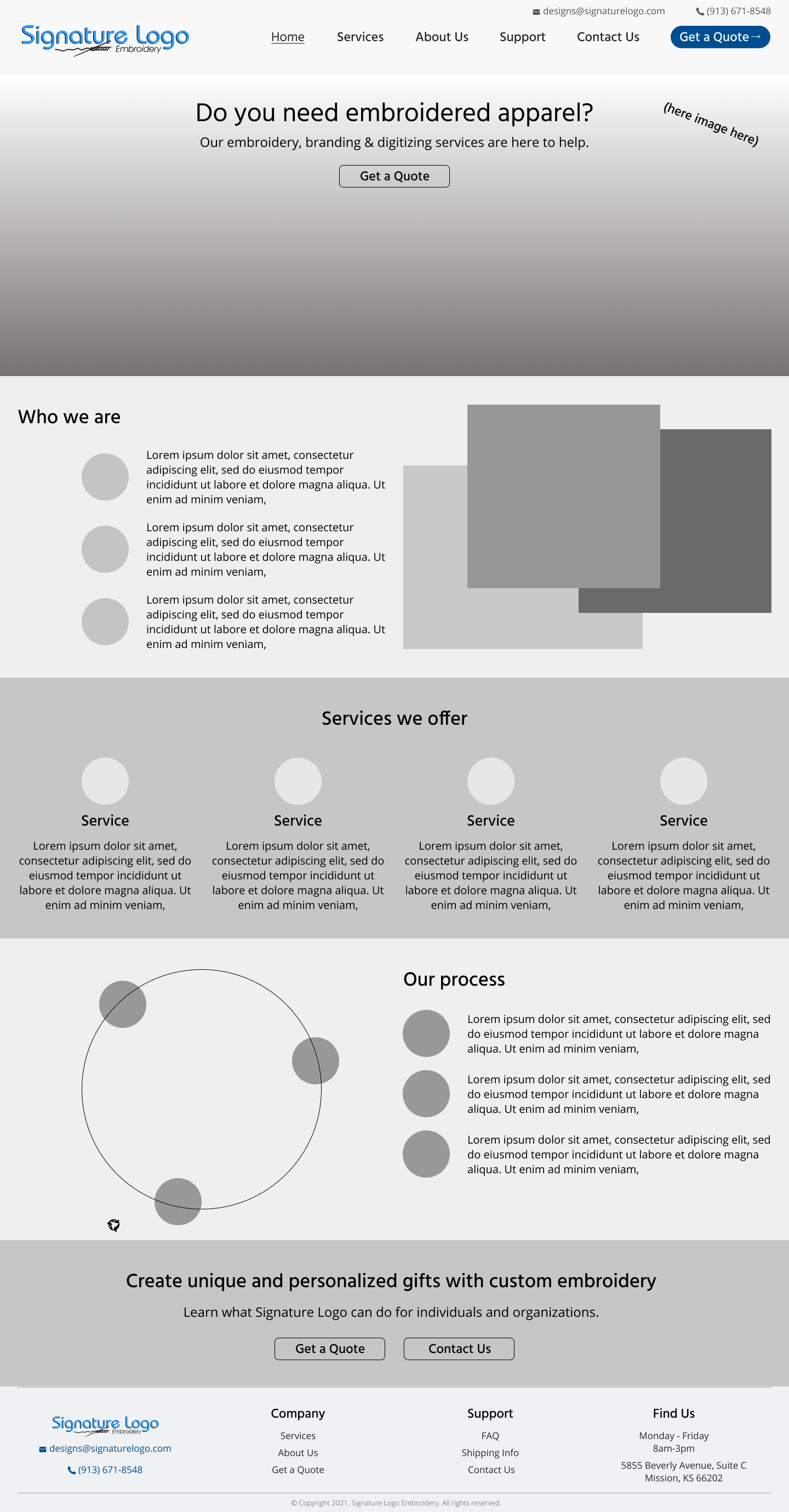
With the groundwork in place, I pulled up Figma and began designing each individual page. At this stage, I kept it black and white (other than the header) and used plenty of placeholder elements that would eventually become photos, illustrations, and UI graphics.
3. User Interface Design
Methodologies
・Branding
・Wireframes (high-fidelity)
・Prototyping
・Wireframes (high-fidelity)
・Prototyping
Goals
・Create style guide with accessible color palette, adjusted logo, typefaces, etc.
・Take wireframes to high-fidelity by applying style guide and fine tuning UI elements
・Prototype user flow to prepare for usability testing
・Take wireframes to high-fidelity by applying style guide and fine tuning UI elements
・Prototype user flow to prepare for usability testing
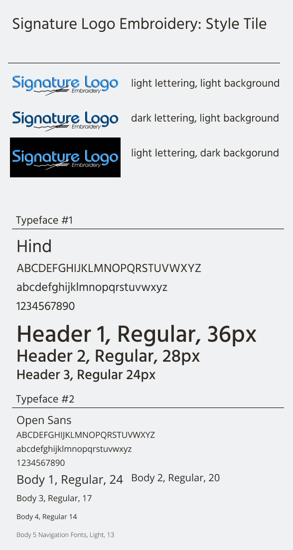
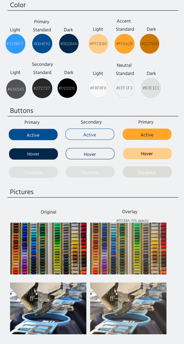
I got in contact with Signature Logo and had their graphic designer send over their current logo design. I took a look at their current color palette, dropped the hex codes into Figma, pulled up the contrast checker, and began testing different combinations.
After confirming combinations, I adjusted the logo's color itself and determined a header typeface and body typeface. Due to the nature of the embroidery business, I chose to go with two sans serif fonts in interest of legibility and creating a welcoming mood.
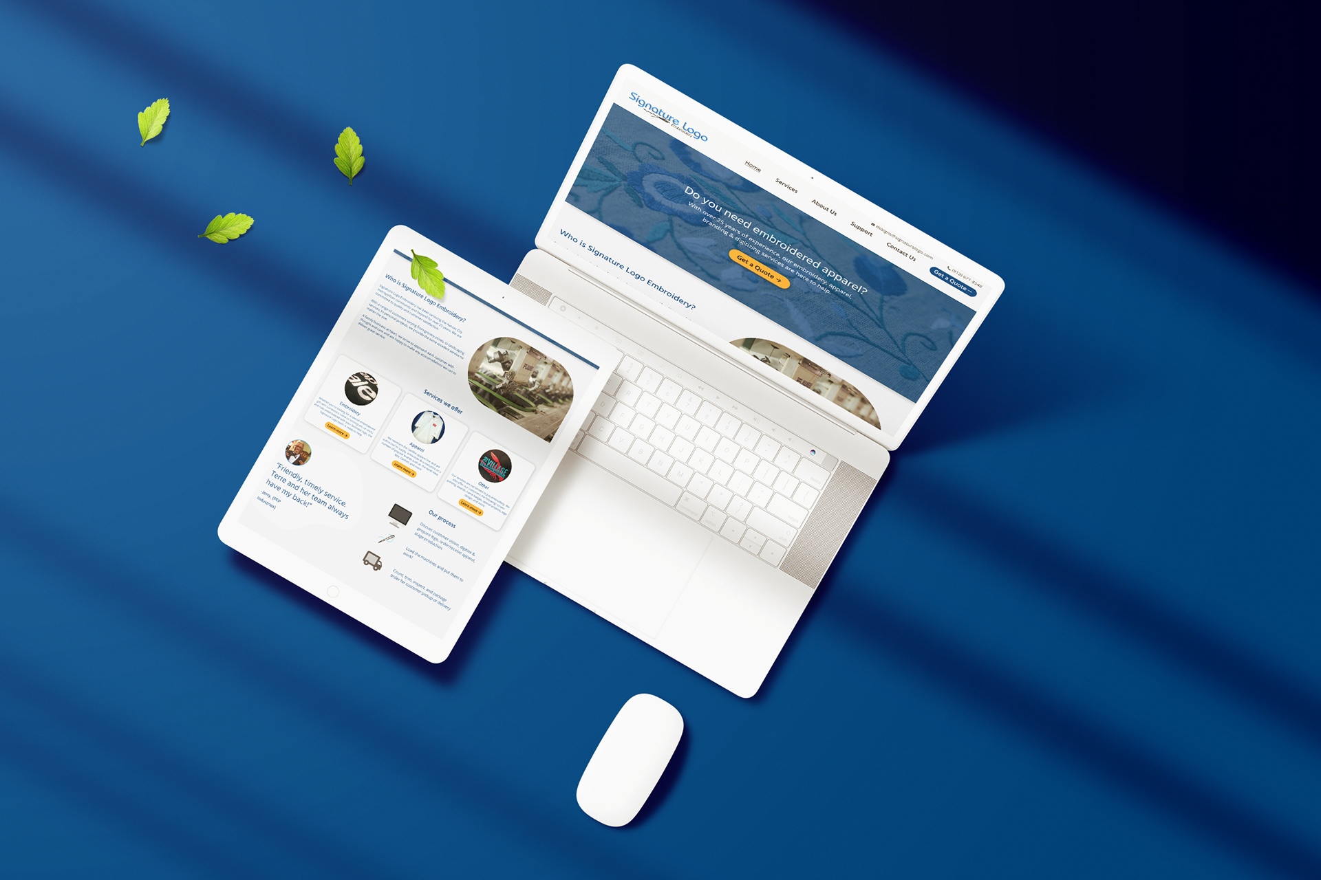
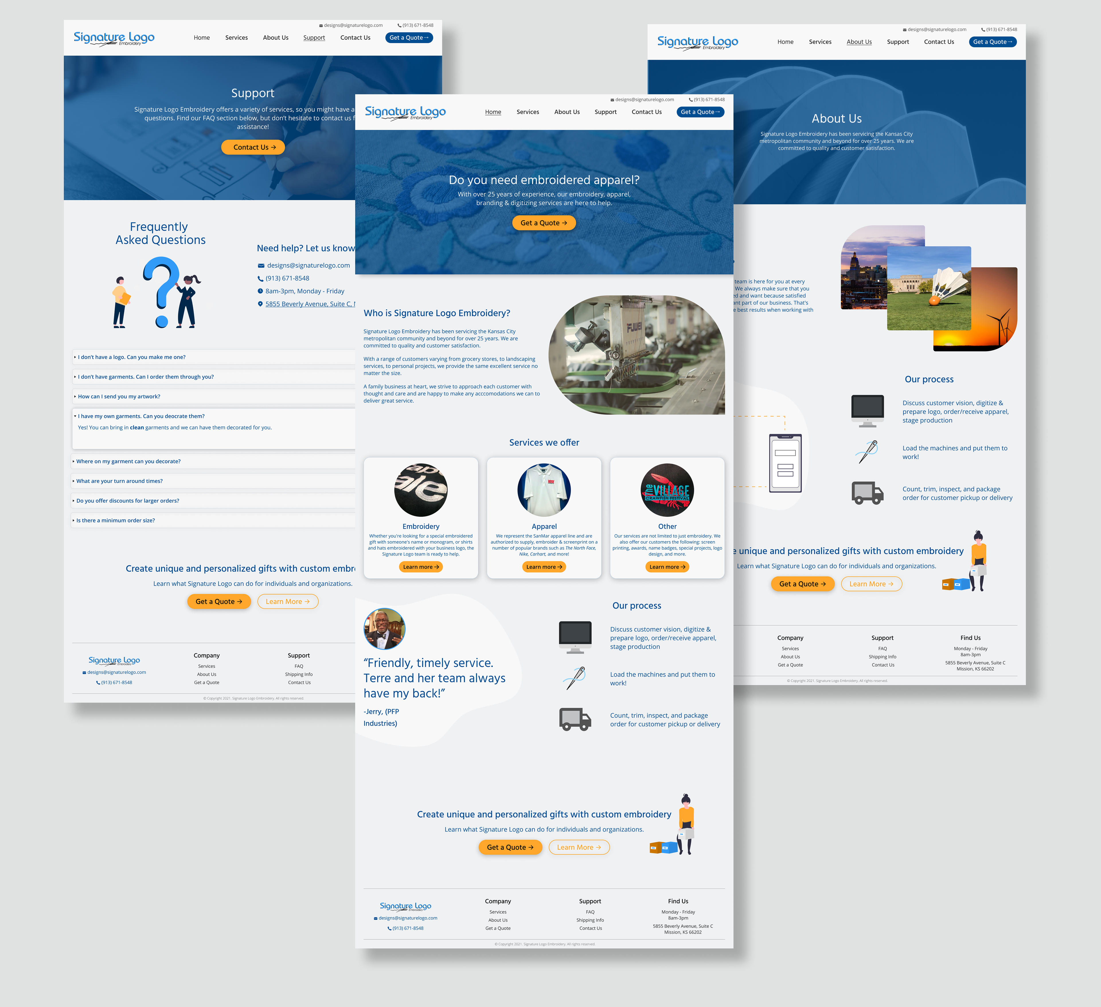
I was able to quickly take my wireframes to high fidelity using my style tile. I built out the 6 main pages of the site along with the essential user flow. I used a balance of photos of their work, photos of Kansas City (where they're based), and illustrations to keep users engaged. At the end of the day, we want the customer to contact Signature Logo in some fashion, so I made sure the site is easily scannable.
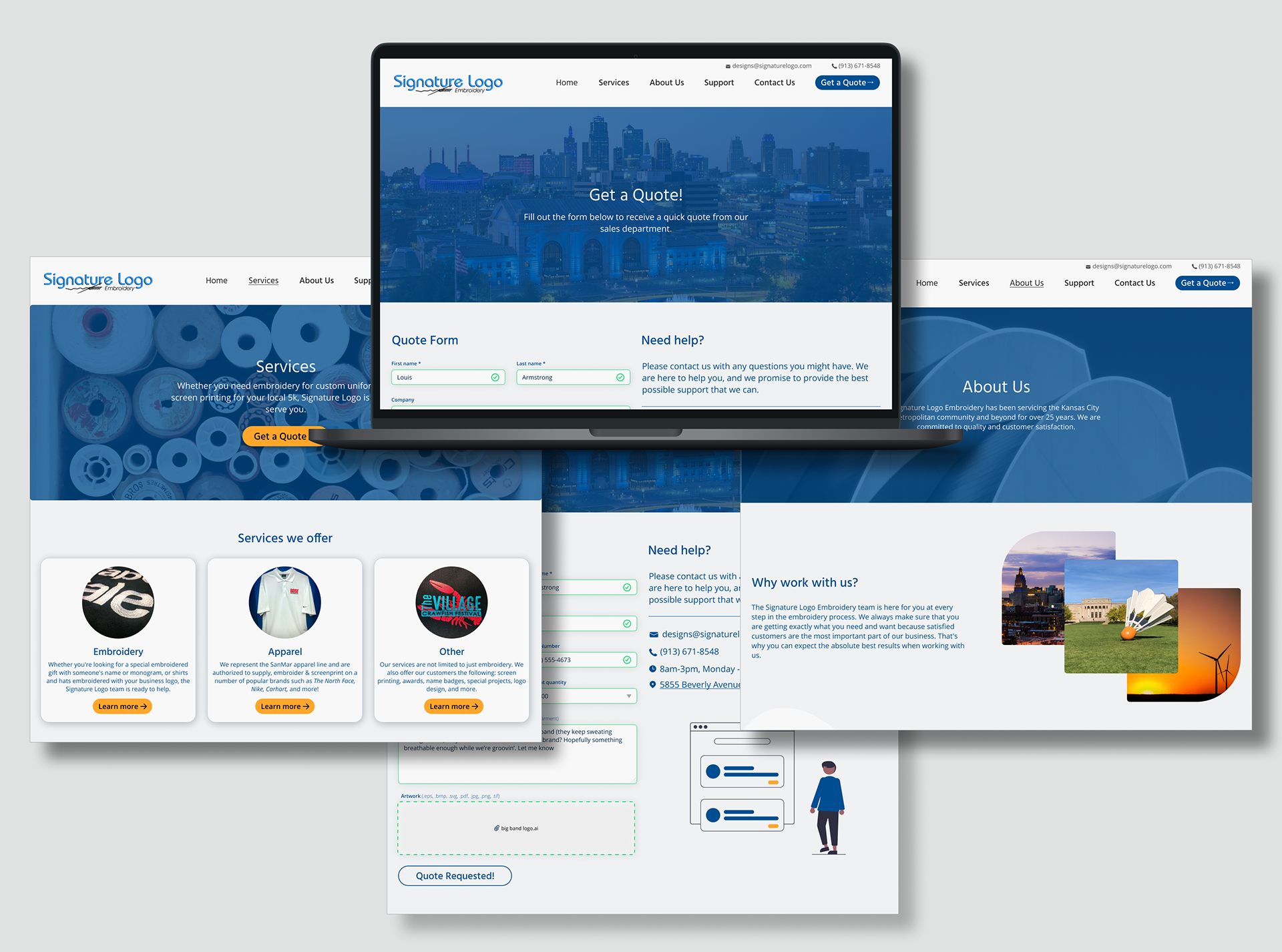
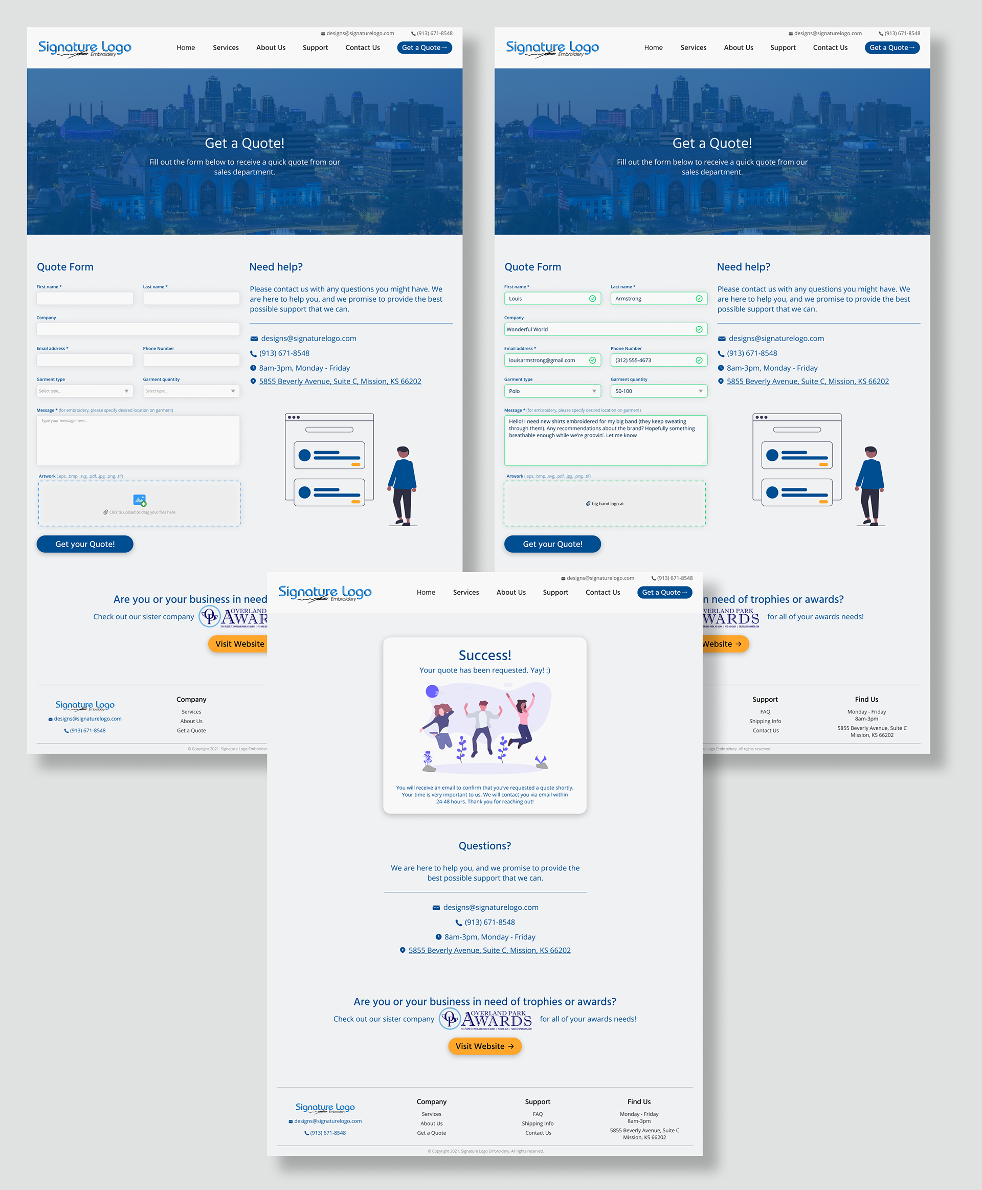
After finishing my wireframes, I went ahead and prototyped the essential user flow so that I could use it to perform usability tests later. In order to make it go as smoothly as possible, I included success states to delight the user, but also to eliminate any doubt. Once the quote is submitted, it loads a confirmation page as well.
4. Test & Iterate
Methodologies
・Usability testing
・Affinity mapping
・Affinity mapping
Goals
・Determine level of success of design and process
・Uncover any faults of design
・Recognize opportunities to improve user experience
・Prototype user flow to prepare for usability testing
・Uncover any faults of design
・Recognize opportunities to improve user experience
・Prototype user flow to prepare for usability testing
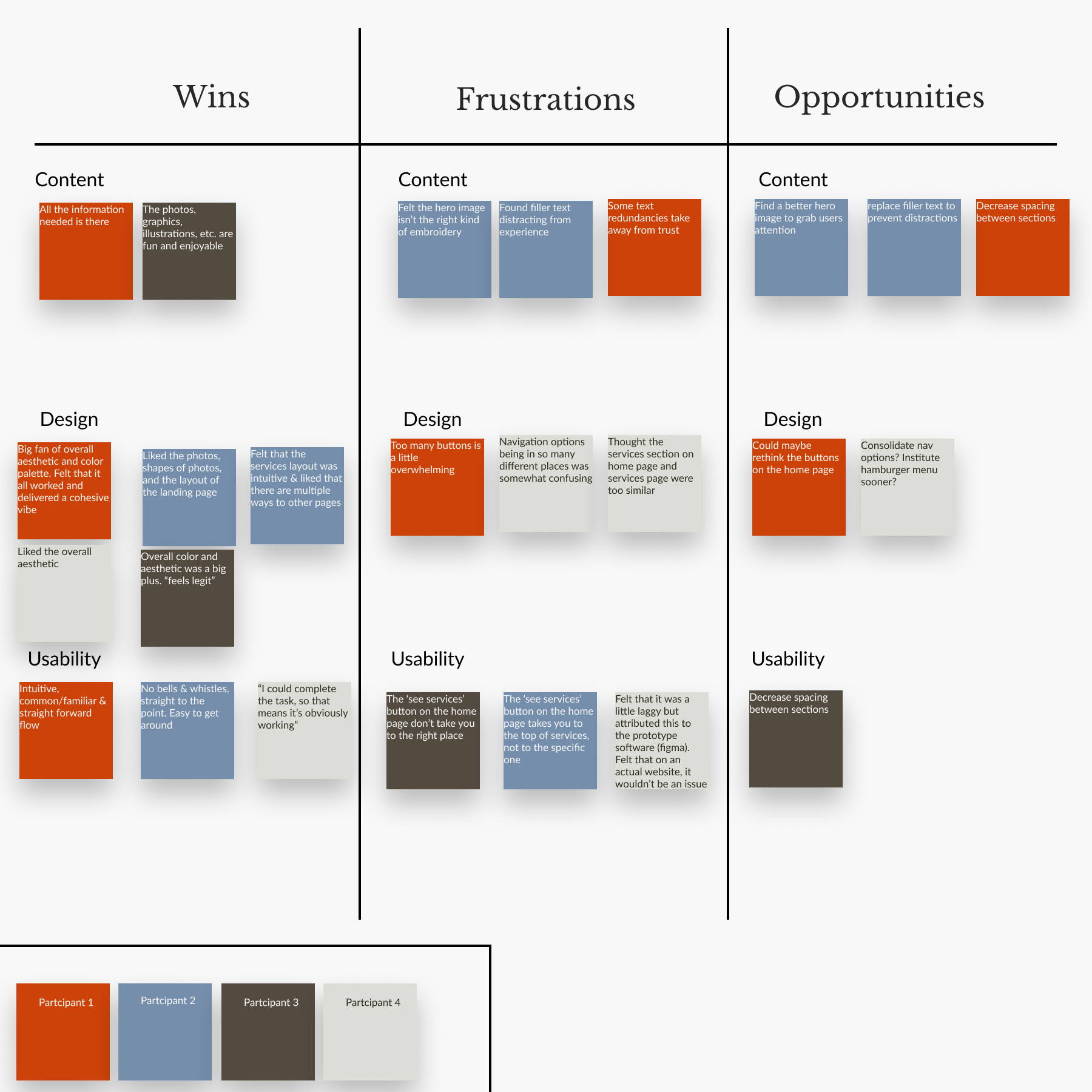
I recruited 4 total participants for my usability tests and performed them over Zoom so I could watch how each user interacted with the site. First, I had them explore the site and then I had them go through the process of requesting a quote. I consolidated my results into the affinity map below.
Final Takeaways
When I first pulled up Signature Logo Embroidery's website, I realized I had a lot of work to do. Not only was it inaccessible, it was incomplete. If a potential client was to find them online, the odds of converting them to a sale were little to none. As a result, it made my job a lot of fun. I could focus on the process and take each step at a time. After completing my wireframes, prototyping the essential user flow, and testing its usability, I spoke with the client and shared my results. The client was impressed and excited, but due to the small size of their company and budget constraints, the client hasn't had the chance to develop my designs quite yet.
In the event that the client cannot secure the necessary funds to hire their own developer, I plan on using WordPress to build out their website for them. I'll use my design as the roadmap and handle obstacles and constraints of WordPress as I go.
While my usability test results are promising, I did receive feedback that I intend on implementing in future iterations:
•More personalized photos of staff and facilities
•Strengthen the 'About Us' section
•Enhance 'Get a Quote' feature so the user receives quote immediately
•Chatbot to assist customers along the way